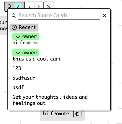
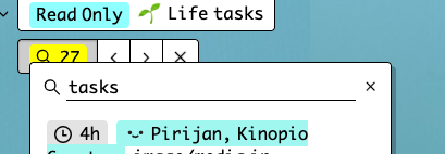
I started working on an extremely simple card search. for v1:
- it’ll only search cards in the current space
- basically a replacement for cmd-f native browser search (which doesn’t properly search absolute-ly positioned elements)
- allows card searching on mobile and desktop apps where browser search isn’t accessible
- it’ll also allow you to view an ordered list of the most recently updated cards (which might replace most uses of a formal ‘history’ function)
2 Likes
copying myself

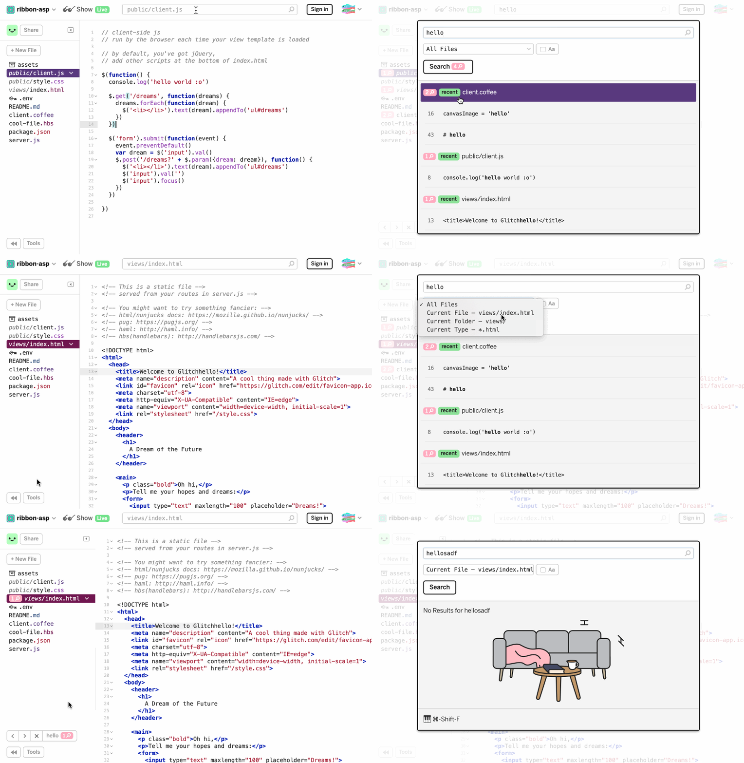
from the search project feature i built for Glitch years ago

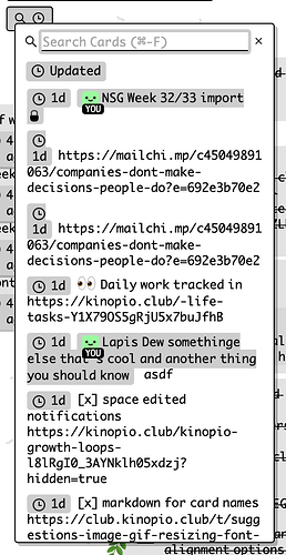
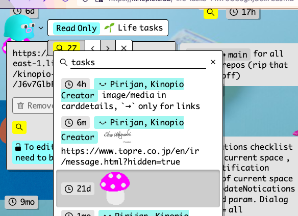
With no search input, the ui displays your cards sorted by most recently updated. Answering the ‘What’s new in this space?’ question.
most of the ui is there , and the fuzzy search mostly works now. I need to wire together the components and sand off a couple rough edges.
2 Likes
I think showing the editedBy user would be useful. I’m thinking of cases where there are a few folks commenting on a space, it would be helpful to see who created what card.
alrighty, if the card was created by someone else, then it shows the user
1 Like
clicking to select results, both recent and searched for
it’ll of course scroll out of screen cards into view
1 Like
little detail: list items have active state when their card is open
1 Like
silently shipped it out, I’ll probably announce it formally tomorrow. let me know how it goes and if you find any bugs 
1 Like
Looks like there’s a couple bugs in mobile and one small little feature I want to add before the ‘official’ release
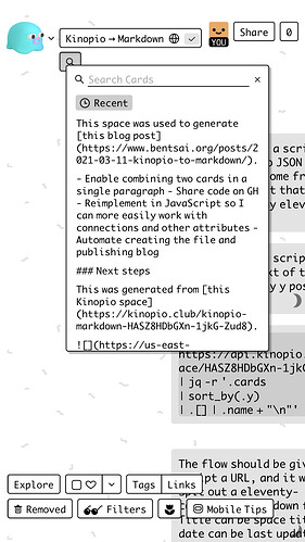
I’ve used it here and there and overall it works great! On mobile especially (because lack of hover state) it can be a little hard to see where one card ends and another begins:
Pretty minor tho:)
it can be a little hard to see where one card ends and another begins
that’s true, I’m gonna try addressing this by relative times in front of each card. but if that doesn’t work, or is too noisy I might not address that specific issue for this release, because a layout solution here also needs to work globally for all lists
1 Like
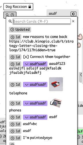
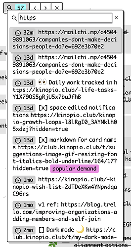
here’s what prepending short relative times might look like with better and worser card data. what do you think? too noisy for the job of searching?
with real data and mild layout tweaks
The relative date blocks do help, and I think having that information is super useful. My one complaint is that it feels too heavy. Is there a way it could be de-emphasized rather than currently it is emphasized.
1 Like
nice, great work. a few first impressions:

-
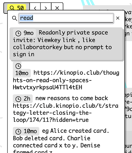
the results dialog feels uncomfortably overlapping the search widget underneath—does it need to occlude so much of it?
-
I like the de-emphasized gray and the abbreviated form in the results. I also appreciate the idea of unifying this with the relative time stamps on the cards, but I miss the longer more readable relative times on the cards. It’s a lot harder to parse when looking at the times on the individual cards.
-
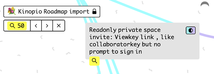
The yellow highlighted magnifying glass on matches is a nice touch.
-
sometimes it is still hard to see where the matching and selected card is. the card edit dialog is not very visually distinct.
-
when the results dialog is open on top of the matching card, it is even harder to see where it is:

1 Like
The dialog is the same offset from it’s button as other dialogs, but I guess you’re using the arrow buttons to navigate results when the dialog is open too? As a possible alternative I could put a set of arrow buttons in the dialog as well
I weirdly found the opposite. When I had a bunch of cards on screen and they all said ‘2 hours ago’, it seemed to take up a lot of space w redundant info and also increased the time needed to read each one. Eg 5 cards w ‘2h’ was easier to skim over than a bunch of ‘2 hours ago’ IMO
1 Like
Not sure how to fix this. Maybe clicking a search result should close the dialog? (Which may also fix that overlapping dialog issue too)
(I do close the dialog on mobile and it feels p okay there. Maybe irl when you click a search result you’re pretty sure it’s the one, so you’re not too likely to need that dialog open still anyways)

