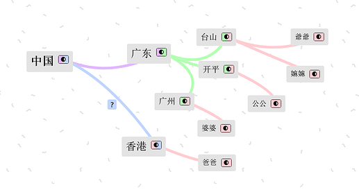
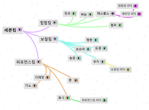
I find that it’s not that clear to distinguish between h2, h3 and unstyled text, especially when Recoleta is not available. And when Recoleta is not available, I mostly mean when languages using non-Latin characters are used.
I’d like to propose that header text size be increased and that a bolder font weight be used for h2 and h3 as well.
Examples
h1, h2, h3 and unstyled in simplified Chinese on Windows
h1, h2, h3 and unstyled in Korean on Windows
Link to example space if you want to play with the CSS or add other languages
It actually looks better on macOS - the default fallbacks for serif fonts have more contrast

