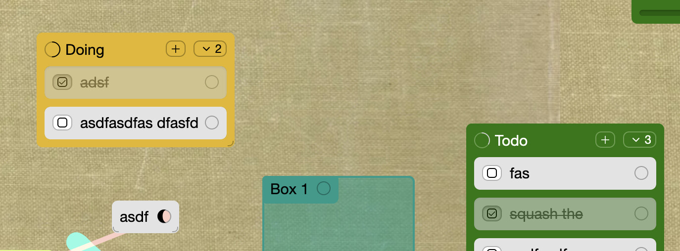
Option a: progress bar around the card count dropdown
Option b: square-shaped progress bar to differentiate from connection circle
Option a: progress bar around the card count dropdown
Option b: square-shaped progress bar to differentiate from connection circle
everytime I use github I think their progress meter is so nicely unambiguous

this is most similar to this variant i did
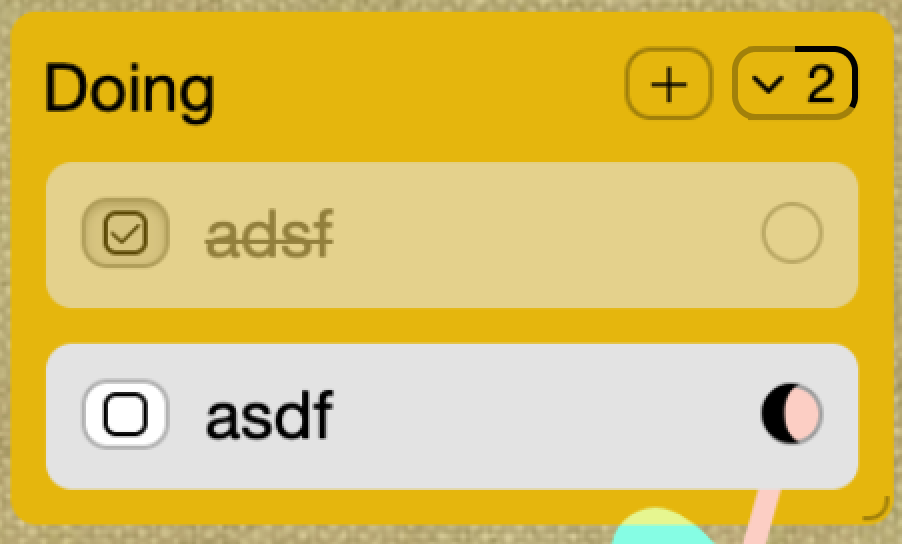
maybe clicking the meter would toggle on a ‘1/2 done’ label
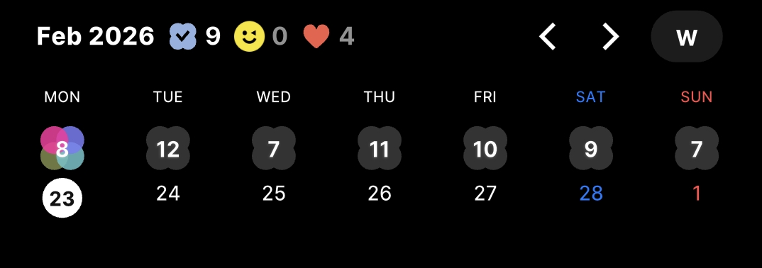
In the screenshot which circle are you referring to? Is it the 23?
no those are the dates, the little clover shape shows the number of undone items (and gets colorful when some are done)
Ahh ic , I think something like that works best when:
i’ll ship the circle progress meter for now, I do think it’s an improvement to the slider because the native html progress element can’t be easily animated like this can
But also squeezing some numbers inside the progress circle might help visually differentiate it from the circular item connector icon
yeah. and it wouldnt be way too small, around the same size that the number in the card count dropdown button on the right side.
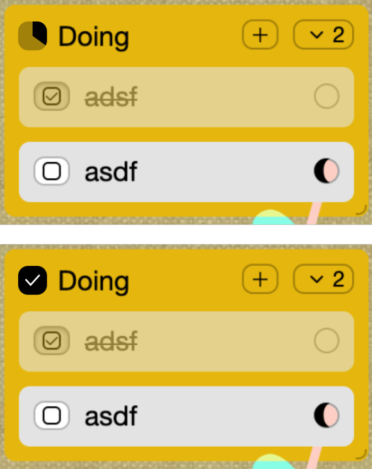
added count inside progress circle.
had to use a 10px font to fix 2 characters in