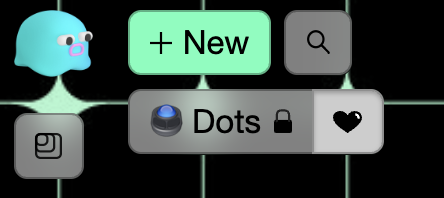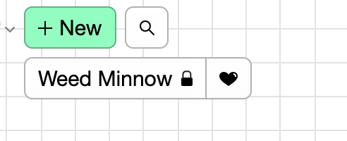
The grey behind the heart (when selected) doesn’t fade like the rest of the grey menu anymore. If you unfavorite it, it becomes transparent as expected.

The grey behind the heart (when selected) doesn’t fade like the rest of the grey menu anymore. If you unfavorite it, it becomes transparent as expected.
that’s because when the space is favorited the button is ‘active’ (similar to how the other buttons get ‘active’ when you open their dialogs). Currently the active state has no transparency in order to increase the legibility of that state (e.g. it should be clear when a button is active).
The reason the active state looks like it does is because it’s the same active state regardless of whether the background is an image or in a dark dialog, so it needs to work in a lot of conditions.
if that’s unclear to more ppl i can experiment with a very dark transparency. But imo it should be a low priority
No that makes sense. I think since they are combined up there, it just through me off a bit—being different than I’m used to is all.
I can see this button being styled differently than other translucent buttons because this button shows state in two ways: 1) the background changes (like other buttons when they are active) and 2) the heart gets filled in. That’s unique, as far as I can tell.
Because of that, I can rationalize making this button stay translucent. Because it’s an on/off toggle, versus a button that activates a dialog.
If you agree, this would be a pretty simple first-issue for someone to tackle ![]()
i’m not against trying it, it’s one of those things that you need to experience irl to really know if that feels awkward.
I agree – would be a good first issue and def endorse someone trying it out and reaching out if they need any help.
done in an upcoming release,
for posterity the code change was v minor

related to recent teams work,
the fav button will show it’s active state inside a dialog , but not in the header. I hope that doesn’t seem too weird irl