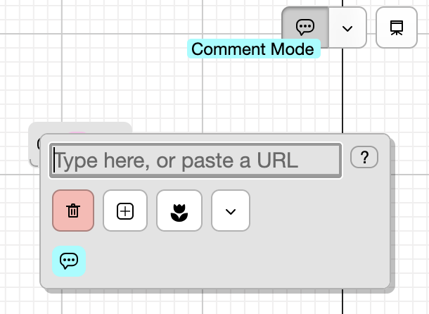
when a card is a comment (either because card.isComment or the name has ((comment-syntax)) ), a comment badge will be displayed. This reaffirms that you’re adding a card in comment mode

when a card is a comment (either because card.isComment or the name has ((comment-syntax)) ), a comment badge will be displayed. This reaffirms that you’re adding a card in comment mode

non-members in open spaces see the ‘comment only’ badge and toggling comments on/off is disabled.
when i squish the view like this though, … it seems like there’s already way too buttons in the header rn ![]() . it’s definitely on the edge
. it’s definitely on the edge
Do you need both Pricing and Upgrade?
Can the Heart or Presentation move to the left side?
Could the comment button lose the dropdown portion and then clicking it would give a dropdown for two options: comment mode + show/hide comments?
this displays for non upgraded users, i would argue that it’s very important
i can try that. it makes toggling comment mode less convenient but maybe that’s a relatively rare thing to do
might make sense to move heart to the left. The motivation for the heart next to the community/discovery buttons is to keep ‘find cool new spaces’ and ‘like them’ actions close together.
presentation i’m less sure of , bc the button to cancel presentation mode is in the top right so there’s an advantage to having those things close together
I guess I was thinking they could be combined in some way, but maybe not…
Like Upgrade could show the Pricing menu since that has the final upgrade button in it as well… I just feel like they are trying to do the same thing. But I get why having both visually for non-upgraded people is important.
Yeah, I think the biggest use case of comment mode is going to be non-collaborators. Collaborators, I imagine, will just switch cards to comments when needed.
Yeah that makes sense…
The one case for heart in the left side is it’s related to the space so being by the space name could work…
but I’m torn on which direction is best.
it’s hard to combine pricing and upgrade bc the pricing dialog conveys a lot. also pricing is standalone for non-signed-in users

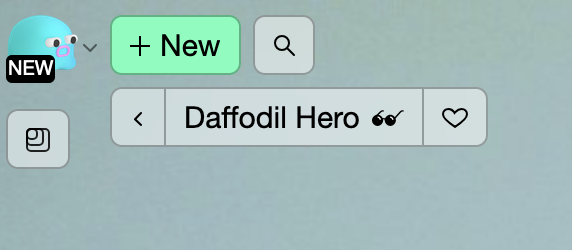
moved heart button to left side

This looks great!
![]() comment mode shipped, marketing for it coming later in the day
comment mode shipped, marketing for it coming later in the day