fyi markdown support is now live,
resizing will come later
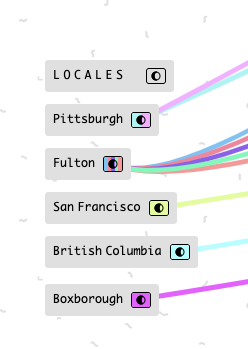
I think once we have the ability to easily resize images, we will want to put cards on top to annotate. For example, I have a list of locales, If I could upload a map image and size it appropriately, I would then put those cards in the positions relative to where they are on the map. But then I would want a way to group this map and keep the z order stable. Right now, it would be too easy to click on the image card and make it cover the cards.

See also Kinopio – Thinking Canvas but instead of the background image, it’s a card image.
@pirijan when you say “card resize”, are you referring only to images, or also ones with just text?
although it’s mostly useful to cards with images, i’d apply the feature universally to all cards for ui consistency
that’s super interesting. would you then proportionally adjust the character limit?
So far, I have appreciated the constraint that I can’t resize things. Cards have a standard max-width, so things tend to look tidy and I don’t have to fiddle with sizing cards so they look good. I hope it will retain this with such a feature 
That’s a very good point, I wouldn’t want spaces to start to feel fiddly or like you had to get them ~just right. That’d suck, and is possibly a good argument for predefined size buttons that only appear for images, or a more constrained resize system.
dragging from a corner would be the most ideal for me
i like the idea of having a default size for cards for making everything neat and original image sizes being the default
perhaps a double click on a corner could revert to the original size? or maybe cycle through sizes
since i understand you want to avoid clutter and make sure it is easy to use
however, i think that having those slightly advanced options for people who want things in a specific way would be nice.
having the word of a sentence cut off like
this
is very annoying to me i wish i could resize the card to fit one more word in a line
just my thoughts
Just to emphasize this was a constraint that really differentiated Kinopio for me initially. As I said in my blog post, Kinopio doesn’t bother me with so many options of size, color, texture, shape. I’m not saying you shouldn’t add appropriate options, but keep the low-friction and low cognitive overhead pls.
This is good point. I run into this sometimes. Having a default size (current), and then Large and/or Extra Large for text cards could be nice. I would suggest keeping in mind readability – don’t exceed ~90 characters Line length | Butterick’s Practical Typography).
maybe after you type either n(30~) characters or a url , a small | large size toggle will appear
When I’m using Kinopio for prose (like writing a paper or a blog post), I’ve found that the width of the cards a bit narrow in terms of readability. So, just another plug for having an option to toggle card size.
I played with the size a bit, and changing the max-width to 480px feels good. It gives about 65 characters per line, which is comfortably inside the range that Butterick suggests.
![]()
So like about 2 months after it first released, I got some feedback about how the font wasn’t the best for prose/essay writing. I experimented with a bunch of alternatives, but eventually concluded that what’s best for thinking isn’t necessarily what’s best for prose.
I’ll think more about what a longer card means for encouraging short/snappy writing that can be more easily connected. Although I suspect that your implicit conclusion that prose is best presented as a blog post is the correct one. When it comes to long-form writing, Kinopio is best for the thinking/planning/outlining behind the writing.
Additionally, kinopio works on mobile but the width of a card is based on it’s content (rather than viewport width). Because of this, having 480px wide cards of text would make a space awkward to navigate on mobile. My design goal is to allow desktop and mobile users to collaborate together and not have it feel like the user with the biggest monitor was the ‘boss’.
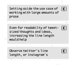
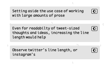
Setting aside the use case of using Kinopio for long-form writing, I think increasing the line length would improve readability and be beneficial for any writing that’s more than a few words. If you look at twitter on mobile, the line length is ~40 characters. Maybe this can part of the desktop zooming feature – like increasing the max width beyond the current 100%, or another way of looking at it is allowing the user to zoom in beyond 100%.

Even bumping up the size by 65px improves the readability by a lot, and I think it doesn’t detract from the experience of connecting and moving around cards.

Agreed, 480px is extreme and I hadn’t considered mobile when I wrote that. I was thinking in the context of being able to have images be larger size too (in this thread) and thinking it would also be helpful to have text that wide.
That’s a noble and admirable goal. I feel like in its current iteration, a mobile user will have a degraded experience. (Presumably you have some stats on how often folks use mobile to collaborate). But as you improve the mobile experience, perhaps changes here can accommodate for different/larger card sizes. ![]()
– ben
yup agreed , will also investigate the more modest 65px increase then as well.